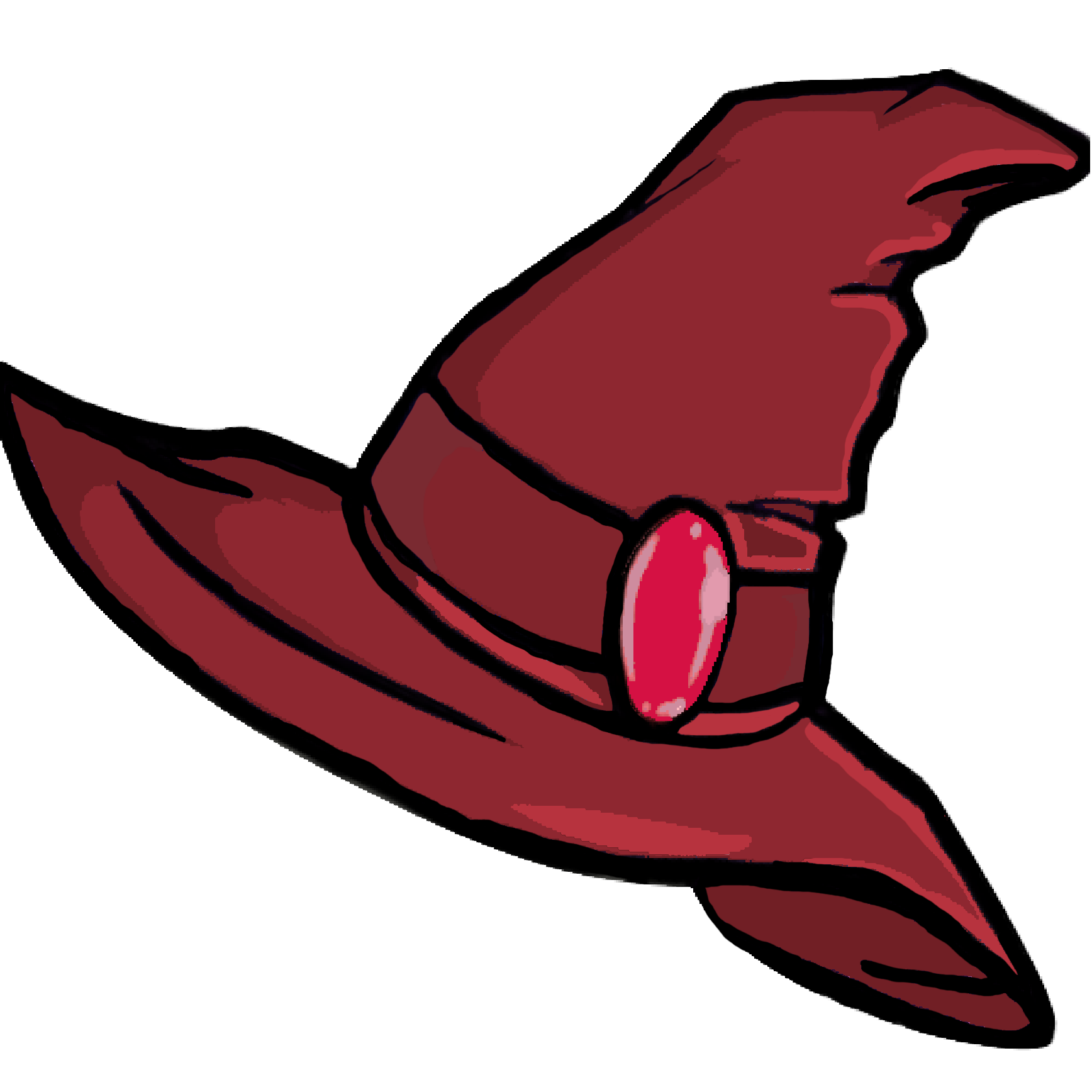
So, I’ve been drawing a lot lately which is also why I haven’t exactly done the “one review per day” thing yet… I frankly wanted to draw more – and that’s fine… because I have 37 review draft titles queued up and I’ve written on four drafts already… I’ll probably post a few times twice and it will be good.
Note: Yes, I need to make an actual “good” drawing of my character holding a brush… but I love this paint.net creation that I did on my laptop using the tracking pad… and hence, I wanna keep using it for a while longer! “
But before that: I finally figured out how to shade!
- Step 1: You create a Mask Layer either by hitting Ctrl+Shift+G in Krita OR by creating a new layer and clicking on the “Alpha” symbol.
- Step 2: Change the layer’s Blending Mode to “Multiply”.
- Step 3: Shade with red or blue.

Red adds a bit of a warm tone to the shades and it works quite well in some drawings but not so well in others. Blue kinda makes it mystical and stuff… which is pretty darn cool! Then you basically do what you’d normally do when you shade. Picture where the light is coming from… and then shade where it’s not.
The important bit here is the difference between hard shadows and soft shadows. Not sure if those are the actual terms. The idea is that when you’re wearing a hat and the sun is shining down on you, it creates this hard line on your face with shadow atop it and light below it. That’s a hard shadow. A soft shadow is when there’s a bit of light coming through but not enough to completely get rid of the shadow. So, it’s lighter but also softer on the edge, which is nice.
Anyway, shading is important as it not only makes stuff look better but it also makes drawings less flat. It’s pretty darn cool and I’ve been getting quite good at it if I do say so myself!
Here is something I’ve been working on. If you’re not good with tentacles, I’m sorry. I didn’t add any lighting yet but it honestly doesn’t need it, I think? Anyway, one tentacle is closer to the body and hence the shadow is “hard”. The other tentacle is hovering over it and hence the shadow is “soft”. So, basically,… depth… in a 2D drawing… Woah!

I also briefly talked about it in my last drawing post, I think, but I wanted to learn about vectors… and then I didn’t. Anyway, I saw somewhere in an art stream on Twitch that people often would use vectors for their line art so that they can make the lines thicker or change the colour and whatnot… so, I tried that… and it’s amazing. In this drawing up there, I spend literally an hour correcting the shapes of the different lines and whatnot. Vectors have “handles” that you can add and remove and move and stuff. They’re super handy! I also ended up drawing the lines too thin and I was able to simply select all lines and make them thicker via a simple button press. Cheers to vectors!
Here in this screenshot from the emote design I made for a friend, I got this eye of sorts and I couldn’t get the shape right in the sketch but I was able to adjust it however I wanted via Vector Layers which is amazing… and seriously, a lot of fun. It’s honestly pretty darn great. Again cheers to vectors!
Now, while shading is somewhat mastered… I still have a lot to learn. I figured I won’t need lighting if I’m just shading but that’s not necessarily true, especially with coloured light sources. For the National Colouring Book Day, Fellow Traveller and Hiding Spot are currently hosting a contest where people can add colour to a simple drawing from the upcoming Indie Game, Beacon Pines (see Interview here!). I’m participating in that and figured that toxic ooze has to be bright… especially at night. So, I did the thing and added lighting. This proved to be quite difficult at first but using the Multiply and Lighten layers as well as a few “Divide” layers (just to experiment), I got to make the toxic ooze look incredibly toxic!

As you can see here, I made it ooze light at the four characters from below which was quite the challenge and while the lighting may not make perfect sense, I feel like I did a darn great job at it for now. I still gotta improve at it, though, which may be something for next time! Maybe I’ll show the full artwork later in another post once it’s done!
This post was originally written by Dan Dicere from Indiecator.
If you wanna get in touch with me, feel free to stop by for one of my Twitch streams. For business inquiries, please reach out via email.


Vectors are great and so are layers and layer types! Multiply FTW! I use it for everything from coloring line work to shading! Great job on experimenting and learning with graphic programs! :)
LikeLiked by 1 person
I should definitely use Multiply with colouring… And yeah, learned about layer styles a year ago but I don’t use it too much. As for layers themselves, I use them nonstop and started labelling them, too. For a long time, I’d forget to switch layers non stop. :d
I wanna experiment with green and purple shading as well as cell shading next!
Glad to see that you do artsy stuff as well :)
LikeLike